The blurred line between devices

Francisco Moreno
Tuesday 22 June 2021
As Apple once proudly asked in an iPad ad: “what's a computer?”, we at Endare expect to still be asking that question in 2021 and onward. For us, a computer is just a device which lets us interact with the tools we need. That is why we have always believed in software portability and responsive design. But, as history has shown us, this flexibility comes with its trade-offs and challenges. Luckily we are all in for the challenge!
When Apple revealed the next generation iPads with the M1 chip, we saw the performance gap between Apple's laptop and tablet lineup shrink even more. Now that both ends of the spectrum share the same architecture we can expect to port applications from one end to the other more easily. So, when can we expect MacOS apps on iPad? Well, when you would ask Apple this question they will assure you they aren't thinking of unifying iPadOS and MacOS because simply porting an app on a technical level does not ensure the level of user experience expected in 2021. There are fundamental differences between tablets (iPadOS) and laptops (MacOS). While the main input method on laptops and desktops is facilitated through a mouse and keyboard, we are all used to touch our screens on a tablet. The context not only dictates the preferred input method but also the needs of the user. Something Apple will keep in mind when the line between laptop and tablet becomes even more blurred.
Case study
In the more open Windows ecosystem, there have been many attempts to merge the tablet and laptop form factor. Laptops with touchscreens aren't at all new, even laptops with detachable keyboards are common. But while the hardware has progressed to new levels, the software hasn't. Windows natively addresses the versatility by providing a designated tablet mode. However, the illusion of a well-refined handheld experience is shattered when the app you need doesn't support the tablet mode UI changes. And when the user often manually switches between modes we clearly see the cracks in the experience. This lack of a seamless user experience shows us that technical possibilities are just one part of the equation. The next question is, should we? And if we should, how would we do it?
Responsive design
Responsive web design is a standard by now and might give us a glimpse in a solution for the subpar user experience mentioned earlier. Everybody expects a website to run smoothly on whichever screen it is displayed. Implementing responsive design is an important part of the design process, already from the beginning. For basic websites, it’s actually quite easy to achieve. A basic website often has the only purpose of communicating information. It doesn't consist of complex operations or a personalized layout. This is in contrast to applications, be it mobile or desktop applications. Applications often require varied input from the user, and the user expects to finish his tasks in an intuitive way. This is why creating responsive applications becomes much more difficult than a simple website. Often developers create single applications to serve the various needs of users on different platforms. But isn’t there a better solution than multiple codebases and journeys?
EVA - The Emergency Vehicle Application
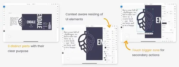
It has been a few years of experimentation and many lessons learned. Even we have tried our best to bridge the gap between the different form factors. A few years back we started an application called EVA. For this project, we design a tablet app which required a lot of different input and visualized information. In the end, we came up with a UI in 3 distinct parts: a small bar on the left side underneath the left thumb for major features, a big open space for the information presented by the app and a right variable portion which, depending on the context, resized to maximize the focus on the action. We saw this as optimal use of the available screen real estate. Later on in the project, we tried 2 things (even though they weren’t part of the initial scope): we ported the UI to mobile and desktop. We learned a lot about this exercise. First of all, scaling a UI designed for a tablet (and touch input) to desktop does not form any UI glitches. Though it feels awkward from time to time because of the big buttons made for touch. Scaling to mobile went a lot less smoothly due to the lack of screen size. In order to do this well we would have needed to rethink the entire app for mobile usage, simply put: we would have needed to start from scratch.
It seems obvious that scaling down an application UI in size is a lot harder than scaling it up but it's not always just about the lack of screen real estate. The issue often comes down to the difference in usage. Some features may be required on desktop while they are useless on mobile. Nevertheless, the only way to successfully launch a mobile (tablet or phone) counterpart of your desktop application is to rethink the core and focus on usability.
Adobe's effort
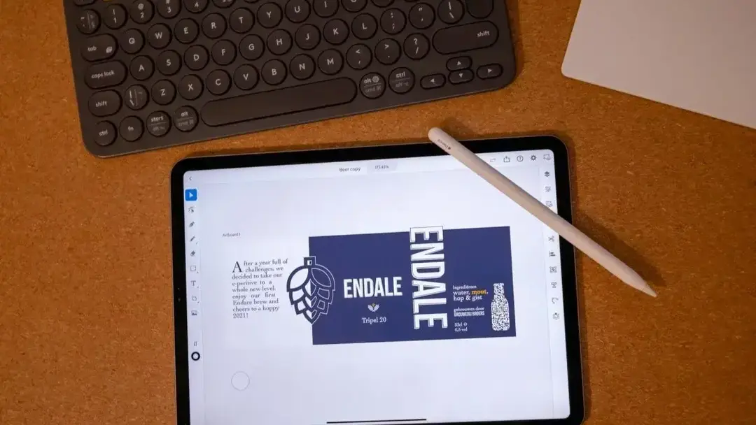
A big company making this enormous effort is Adobe. Last year we saw the beta of Photoshop on iPad and a full release of Illustrator on iPad. Two apps with an enormous user base and an absurd amount of features. We must admit: Adobe did a pretty good job at it. While the Photoshop app isn’t just ready for primetime due to the lack of major features, I felt capable of completing a task in Illustrator on my iPad. The Endale label (our own beer) was made entirely on iPad, something I wouldn’t be able to do if it weren’t for some big UI and UX changes.
The biggest step forward with these mobile implementations is the focus on the content. Creation apps need to focus on the content. This was the biggest challenge for these feature heavy apps but Adobe pulled it off by doing one simple trick: one bar on the left containing the major features, in the middle a big canvas for the content and on the right a submenu for specific features which scaled according to the context. Something we saw as a solution for our tablet app EVA in the past. But Adobe went a step further because of the need to add secondary input. On desktop, you would simply right click if you wanted to perform a specific task. This is however impossible on touch devices. But Adobe had a stroke of genius to add a touch trigger zone. When performing an action whilst touching this trigger zone you would do the secondary action (like proportional scaling when scaling). But wait there's more: when swiping on the trigger zone you unlock a third action (proportionally scaling from the center)! Adobe did not only fix the lack of a secondary action but rethinking the input methods added even more flexibility. These touches of eye for detail resulted in a pleasant application in which I could fully focus on harnessing my creativity. This is the way a mobile counterpart of a desktop app should feel like.
The next step
People are always locked to their computers for work, eight hours behind a computer in order to do their tasks. But what is a computer? Should a computer be a stationary desktop like in the ‘90s? Or can it also be a highly portable screen like a tablet? Either way, we at Endare are ready for whatever comes next and are passionate about providing the best UI solutions for your next workflow!
Oh and Adobe, if you could please make a mobile version of Adobe XD. You can read about why I love this tool so much here.
Book a meeting
Discuss your idea directly with one of our experts. Pick a slot that fits your schedule!